
Overview
The
challenge
1st-grade students (ages 6–7) in Germany are just beginning to learn number recognition, counting, and basic quantity understanding. Traditional classroom tools often fail to maintain their attention, and for children who can't yet read fluently, text-heavy interfaces create an extra barrier before the learning even begins.
Our goal for the Foundations of Software Engineering course was to design and build a practical classroom tool: a curriculum-aligned game where at least 80% of students could correctly complete core tasks during testing. Everything had to work with the minimal amount of reading, without data storage, and without internet, running fully offline on classroom PCs and tablets.
My responsibilities covered UI/UX design end-to-end, building the full visual design system, backgrounds, and layouts. Because our pre-literate users couldn't rely on text, I also took ownership of the sound integration implementing background music and auditory feedback loops in Godot to guide and reward the children through audio-visual cues.
Research
Who we
designed for
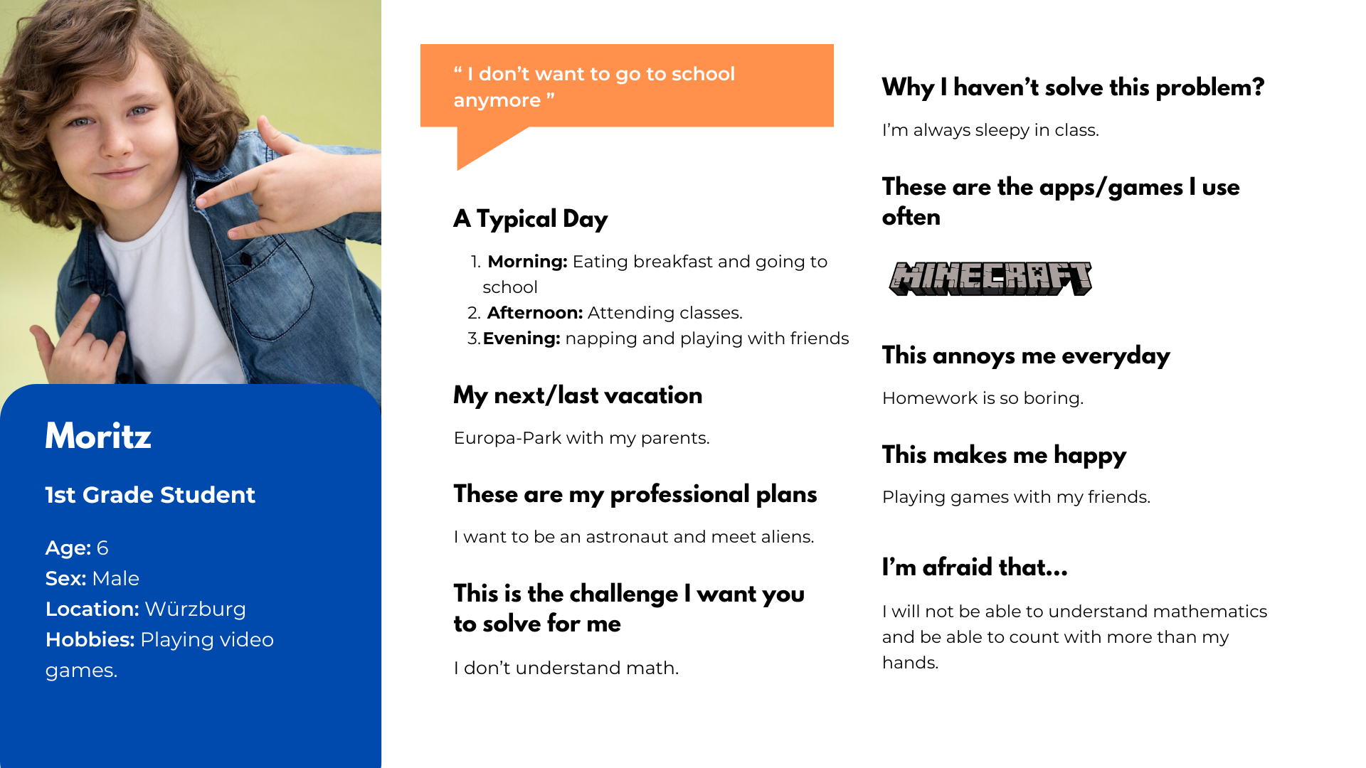
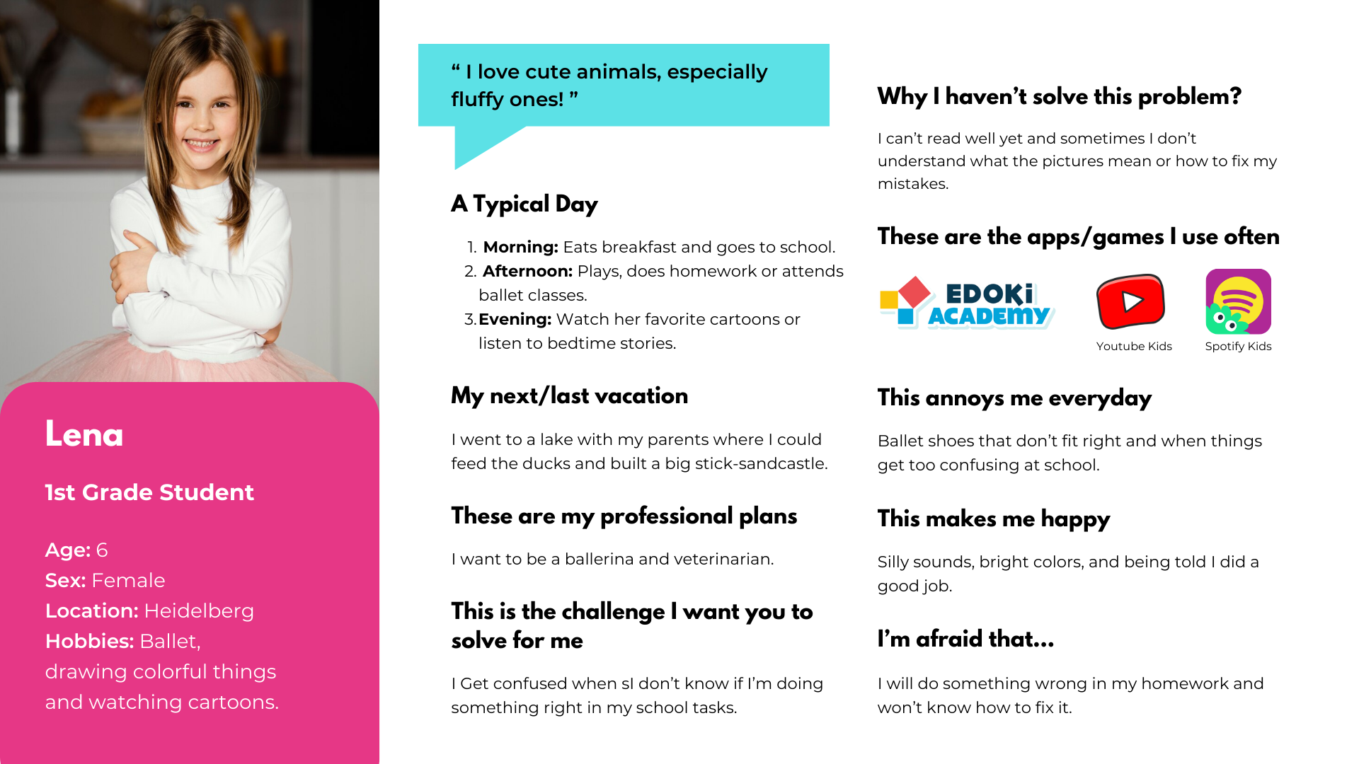
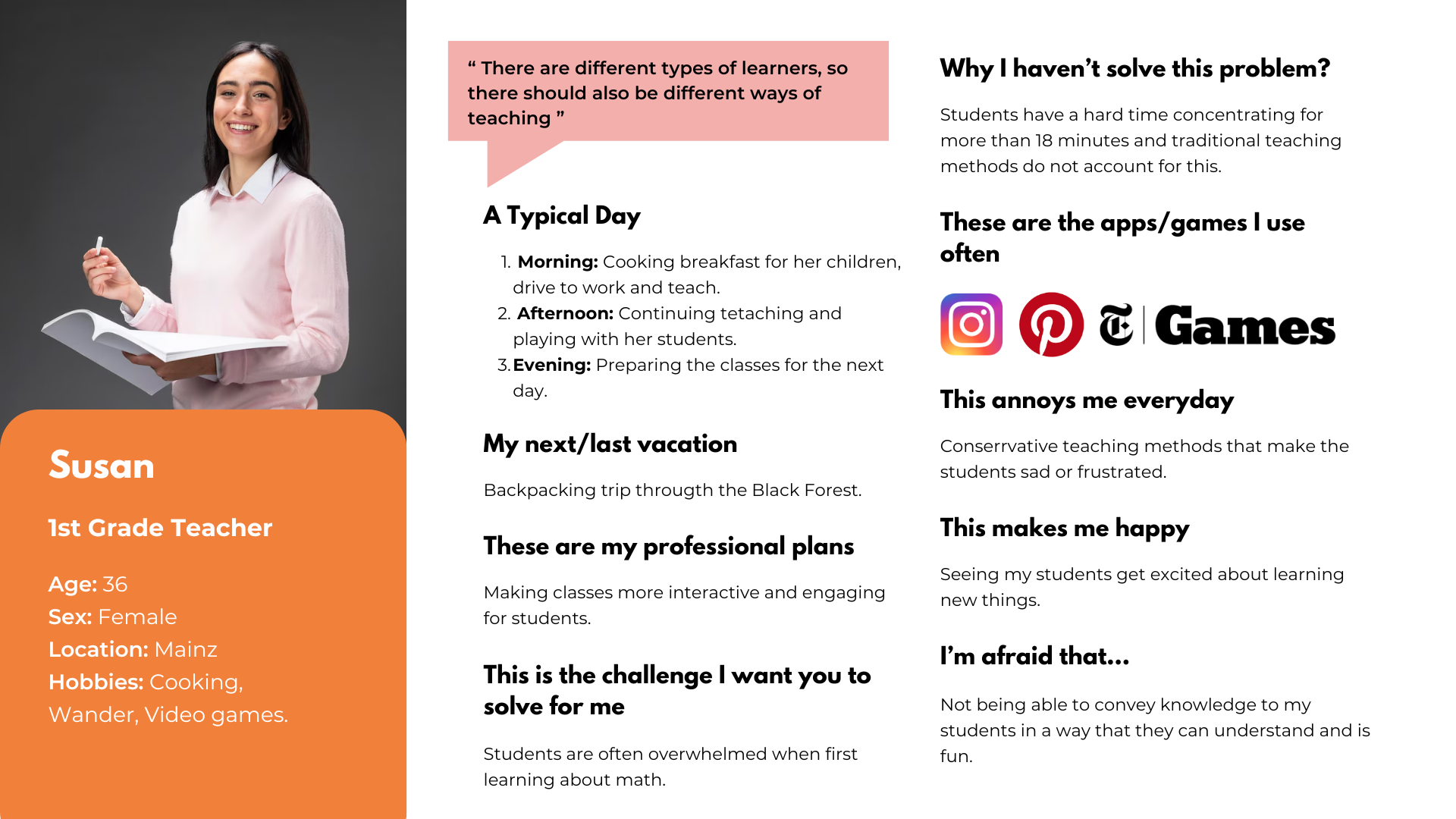
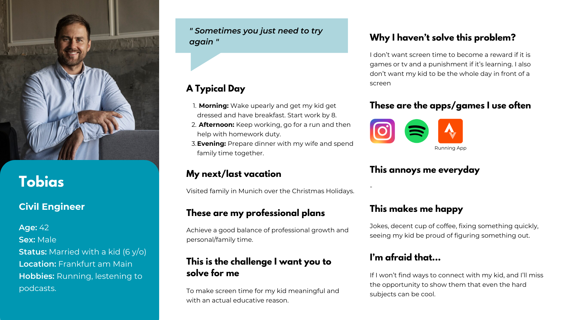
We identified three distinct user groups whose needs had to be balanced: the children playing the game, the teachers integrating it into lessons, and the parents supervising at home. Each persona shaped a core design constraint.
Design Constraints
Guiding
principles
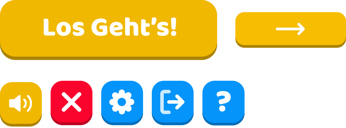
No text where avoidable. Since the target users are pre-literate or early readers, all navigation, feedback, and instructions had to work through images, animations, and audio. The only text in the game are minimal button labels.
Positive-only feedback loop. Wrong answers show visual cues — a red button, a soft hint — but never score penalties, locked screens, or visible failure counters. The game is designed to encourage retrying without anxiety.
Zero data, zero backend. To ensure absolute privacy for the children, there are no logins, accounts, or internal data storage. But teachers still needed to track progress. To solve this, we designed a manual, parent-assisted tracking loop: the game encourages parents to take screenshots and time logs of completed sessions to share directly with educators.
Design Process
How we
built it
We used a hybrid SCRUM/Kanban methodology via GitLab's board, with weekly Thursday standups and rotating roles — each team member cycled through Product Owner, Scrum Master, and Developer across the 4-month sprint.
Define
Established the product vision: teach 1st-grade German students number recognition (1–10) and quantity understanding. Defined two mini-games as the MVP scope with a goal of 80% task completion in testing.
Design
Built a full visual design system: Bagel Fat One & Baloo typefaces, a lively color palette, and large rounded UI elements designed for the motor precision of 6-year-old hands and touchscreens.
Develop
Implemented in Godot using GDScript with a modular scene architecture. Each mini-game, menu, and component as an independent scene to support future expansion without code rewrites.
Test
Ran 8 formal test cases (TC-NAV, TC-CH, TC-FM, TC-UI series) mapped to use cases. All tests passed. Validated navigation, feedback states, ingredient logic between scenes, and audio consistency.
Design System
Visual
language
NomNom's design system was built to be eye-catching, readable without literacy, and consistent across all scenes. Every element — colors, type, buttons — serves a functional purpose for a 6-year-old user.
We also leaned into the UX heuristic of Recognition Before Memorization. So essential information remains permanently visible until the action is complete, ensuring we never overload the kid's memory.
Color Palette
Typography
Navigation Buttons & Keyboard
Design Challenges
No text.
No pressure.
No data.
"There are different types of learners, so there should also be different ways of teaching."
— Susan, 1st Grade Teacher personaHMW guide a child who can't yet read fluently through the entire game without a single written instruction?
HMW make wrong answers feel like a natural part of play — so children keep trying without frustration?
HMW give teachers and parents confidence in the game without building a backend, login system, or any data storage?
The Mini-Games
What we
delivered
Two curriculum-aligned mini-games, each with a tutorial video, positive/negative visual feedback, and sessions designed to last 5–10 minutes. Everything communicates through visuals, animation, and sound.
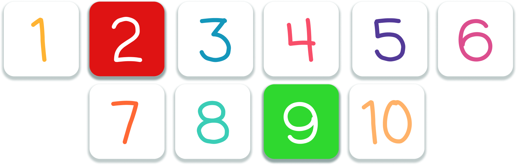
Counting Hands
Feeding the NomNom
Counting Hands
Infinite loop game where two hand-gesture images display raised fingers. The child picks the matching number (1–10) from large buttons. Correct turns green with a success sound; wrong turns red and stays visible so they remember what they tried. Every 5 consecutive correct answers triggers a celebratory animation, then the streak resets.
Feeding the NomNom
Is a linear flow game NomNom (the "monster") asks for food and then a recipe book shows the required ingredients (toast, lettuce, tomatoes, cheese) with the exact quantities. The kid drags the ingredients into a basket until the previous requirement is fulfilled. Once complete, they drag the finished sandwich to NomNom's mouth — triggering a happy eating animation and ending the round.
No-Penalty Feedback
The interaction model was designed so every action is repeatable without penalty. Adding too many ingredients shows a warning, without having score deducted, or blocking progress. A wrong number answers require a retry but never locks the player out. The game is designed so children feel free to experiment without fear of failure.
Tutorial Videos
Since we couldn't rely on written instructions, each mini-game has a short animated tutorial accessible at any time via the button on the selection screen. It plays before the game begins and can be re-watched at any point — no text, just visual demonstration.
Testing Results
What the tests
confirmed
We designed 8 formal test cases mapping directly to our core user stories, combining black-box functional testing with exploratory UX evaluation. All 8 tests passed, validating our core UX hypotheses.
Visual feedback does the teaching
Test cases TC-CH-01 and TC-CH-03 confirmed that our color-coded button states (green/red) and audio cues were immediately understood without any text labels. The feedback loop successfully communicated correct or wrong, validating our no-text constraint.
Continuity preserves the mental model
Test TC-FM-01 validated that ingredient quantities shown in the recipe scene carried over exactly to the interactive cooking scene. For a 6-year-old, if these numbers didn't match perfectly, they would lose their cognitive mapping of the task.
Audio loops need careful management
TC-UI-01 tested that background music loops without duplicating across scene transitions, which was a real Godot implementation challenge that required deliberate architectural decisions with AudioStreamPlayer.
Outcomes & Reflection
What this
project taught me
This was my first time applying UX design principles to a game, and it was a genuinely interesting experience. The biggest challenge wasn't just the "no-text" rule, but learning how to truly think like a six-year-old. During our testing phases, we quickly realized that interface patterns we considered completely intuitive as adults weren't always obvious to kids. It was a great lesson in letting go of my own assumptions and letting user behavior drive the design.
On the technical side, stepping out of Figma and into the Godot engine was a steep learning curve. Working with GDScript and trying to wrap my head around a modular scene architecture for the first time was challenging, but it fundamentally changed how I work. I no longer design isolated screens; I think in terms of reusable components. Ultimately, this project taught me the value of mutual empathy within a team and the importance of designing with true user-centricity.